There are some hard and fast rules when it comes to interior design. Dining room chandeliers should hang 60 to 66 inches off the floor. Never match the color of your walls to a color in one of your fabrics. Hang curtains all the way to the ceiling to make the ceilings appear higher. But when it comes to making a room -- especially a small one -- look and feel bigger, there truly is no one right answer.
So whether you're looking for a paint color to live with for a while or one that makes the tiny third bedroom look just a smidge bigger, we consulted designers, paint companies like PPG Paints, and painters to come up with these 14 paint colors you should consider for your next project. Save them to your home inspiration board on Pinterest, and read on for tips on how to best use them.
)
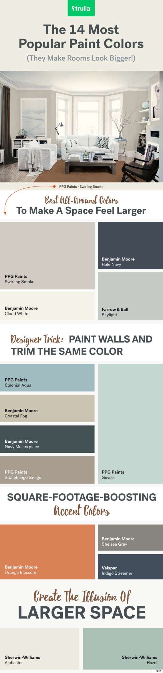
Best all-around colors to make a space feel larger
1. PPG Paints Swirling Smoke
Swirling Smoke is a go-to for Lee Crowder, a colorist with Darling Homes in Dallas, TX. "I have to stop myself from using this one too much because it is just a great all-around color. It is light with a tint of gray and is very calming."
2. Benjamin Moore Cloud White
"Paint ceilings white and use lighter colors to make a room appear larger," suggests Dan Schaeffer, owner of Five Star Painting in Austin, TX. "Think light grays, blues, and other neutral colors. You can also use an eggshell or satin finish to help reflect light."
3. Benjamin Moore Hale Navy
Hale Navy has a spot on Benjamin Moore's bestselling blue shades list -- and for good reason. "It is a favorite to make a space feel bright," says Sean Juneja, co-founder of Décor Aid. "I equate brightness with freshness, and Hale Navy is very fresh and clean."
4. Farrow & Ball Skylight
"Skylight is also an amazing color; a clean, light gray-blue," adds Juneja. "On a whole, cool colors are fresher and brighter than warm. Warm colors evoke intimacy and softness. Cool colors make me think of bright days and breezes and a sharpness that you can only capture with blues and greens."
Designer trick: Paint walls and trim the same color
5. Benjamin Moore Coastal Fog
"I recently painted a family room -- walls, trim, crown, and built-ins -- Benjamin Moore Coastal Fog. There were so many windows, French doors, and built-ins in this room, it felt so choppy having the Coastal Fog on the little bit of wall space and white trim everywhere else," says Lucas. "By painting the walls and trim [the same color], it created an entirely different space and transformed and modernized the traditional room."
6. Benjamin Moore Navy Masterpiece
The matching-walls-and-trim tactic works with deep shades too (but beware that glossy finish). "I have done this same technique with darker colors as well, painting a formal living room Benjamin Moore Navy Masterpiece," adds Lucas. "The darker color creates a more cozy and dressy environment. I suggest using a satin or semigloss ... the higher the gloss, the more unforgiving the paint is!"
7. & 8. PPG Paints Geyser and Colonial Aqua
Lee Crowder suggests natural hues for this floor-to-ceiling trend. "Clean colors like celadon or a sea glass always make a room feel light and bright," she says. "PPG Paints Geyser and Colonial Aqua are great selections for that feeling."
9. PPG Paints Stonehenge Greige
"The general rule is, the lighter the color, the bigger and brighter the room will appear," suggests Geoff Sharper, owner of Sharper Impressions Painting Company. "Stonehenge Greige by PPG Paints is a very popular color that is light enough to enlarge a room but still gives you some of the modern and hip grays that are trendy right now."
Square-footage-boosting accent colors
10. & 11. Benjamin Moore Chelsea Gray and Valspar Indigo Streamer
"Feel free to go crazy with saturated colors on cabinetry for an instant update on outdated cupboards," adds Geller. "Dark grays like Benjamin Moore Chelsea Gray and navy colors like Valspar Indigo Streamer quickly bring them into 2016."
12. Benjamin Moore Orange Blossom
"Orange radiates warmth and generates happiness, whether it's a tender, romantic hue or vibrant and energetic. Different shades are highly personal and subjective, but one thing is for certain: Using orange is always a bold and uplifting move," says Amy Courage, co-founder and interior designer at DesignBar in Chicago, IL. "Benjamin Moore Orange Blossom is an elegant and sophisticated shade that enables the relaxed energy needed to make a room appear lighter and brighter."
Create the illusion of larger space
13. Sherwin-Williams Alabaster
"This is their 'Color of the Year,' and I have suggested it to a client who wants to open up a room," says Melinda Peters Elliot of Fine Designs & Interiors Ltd. in London, OH. "It looks particularly good when there are a lot of windows and the trim around the windows is white."
14. Sherwin-Williams Hazel
"This is such a peaceful and calming color," says Alice Chiu of Miss Alice Designs in San Francisco, CA. "It can make a small space appear larger because it naturally brightens up a room with its vibrancy. It's like being in the middle of an expansive ocean sparkling in a lovely mix of blues and greens."
What are your favorite go-to paint colors for small rooms? Share your favorites in the comments!
Also on HuffPost:
